PT
A MARCA
Crunch Mama é uma padaria e pizzaria em Florianópolis, com foco em massas de longa fermentação. A proposta é que o estabelecimento funcione do amanhecer ao anoitecer, sendo uma padaria durante o dia e uma pizzaria à noite.
EN
THE BRAND
Crunch Mama is a bakery and pizzeria in Florianópolis, focusing on long-fermented doughs. The concept was to have the establishment operate from dawn to dusk, serving as a bakery during the day and a pizzeria at night.

PT
DESAFIO
O principal desafio era tirar as ideias do papel e construir uma marca autêntica do zero. O projeto pedia uma personalidade irreverente, rock'n'roll, envolvente e descolada, que equilibrasse o vintage e o moderno, além de fugir da linguagem tradicional, italiana e rústica comumente associada a padarias e pizzarias no mercado.
EN
CHALLENGE
The main challenge was to bring the ideas to life and build an authentic brand from scratch. The project called for an irreverent, rock'n'roll, engaging, and cool personality, that balanced vintage and modern elements, while also avoiding the traditional, Italian, and rustic language commonly associated with bakeries and pizzerias in the market.
PT
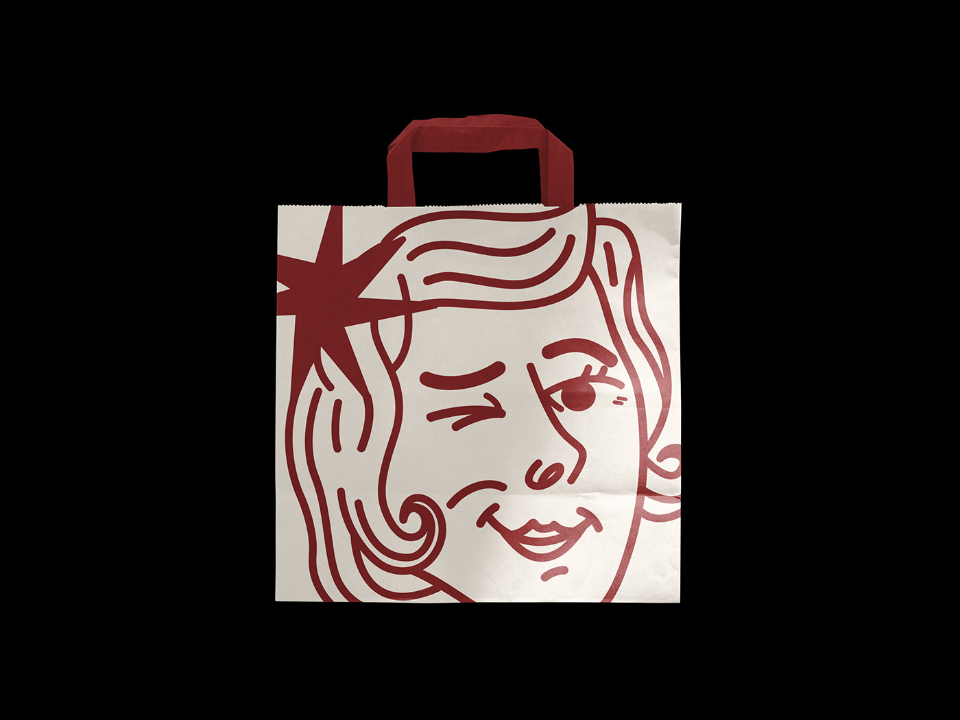
SOLUÇÃO
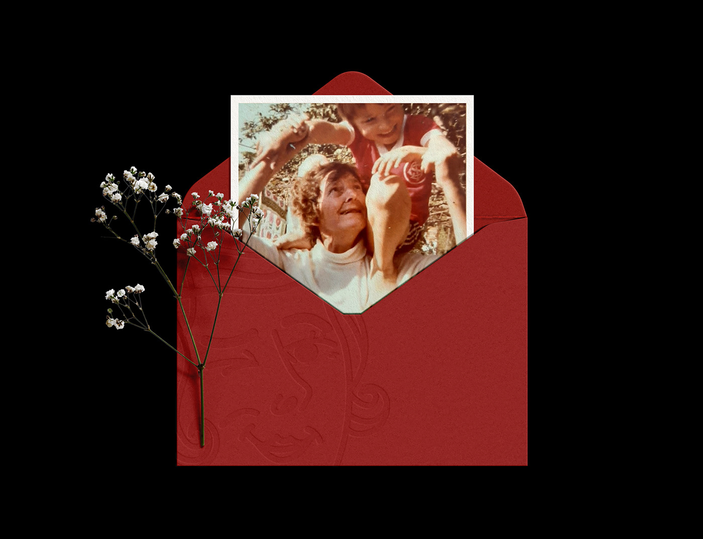
O projeto passou por diferentes percursos e, após várias trocas colaborativas e profundas com o cliente, surgiu uma ideia forte e consistente de homenagear a avó do cliente, Frida. Durante a infância, Roger compartilhava com sua avó o sonho de abrir uma padaria. Frida tinha a mesma personalidade que queríamos para a marca. Ela era como uma Dercy Gonçalves (atriz brasileira conhecida por sua personalidade autêntica e audaciosa), não tinha papas na língua, era ácida, polêmica e impactava as pessoas. Encontramos ali um fio condutor para construir toda a história de Crunch Mama.
EN
SOLUTION
The project went through different paths, and after several collaborative and profound exchanges with the client, a strong and consistent idea emerged to pay homage to the client's grandmother, Frida. During childhood, Roger shared with his grandmother the dream of opening a bakery. Frida had the same personality we wanted for the brand. She was like a Dercy Gonçalves (a Brazilian actress known for her unfiltered and bold personality), sharp, controversial, and impactful. We found a guiding thread there to build the entire story of Crunch Mama.

PT
NAMING
Crunch Mama é um resgate a Frida. Representa uma avó que era divertida, enérgica e levada. A escolha de um nome estrangeiro favorece a pegada rock'n'roll, que equilibra o vintage e o moderno. Crunch Mama é irreverente e envolvente, tem uma sonoridade que transmite a crocância do pão e da pizza e carrega a pegada audaciosa que queríamos para a marca.
EN
NAMING
Crunch Mama is a tribute to Frida. It represents a grandmother who was fun, energetic, and mischievous. The choice of a foreign name favors the rock'n'roll vibe, balancing vintage and modern elements. Crunch Mama is irreverent and captivating, with a sound that conveys the crispiness of bread and pizza, and carries the boldness we wanted for the brand.
PT
ESTRATÉGIA
O envolvimento do Roger, nosso cliente, foi um ponto fundamental no projeto. Com perfil perfeccionista, estava inteiramente dedicado ao projeto. Tendo protagonismo não só nas receitas, mas também em toda a construção da marca. Roger falava muito sobre seu desejo de transferir energia para as pessoas e causar impacto em quem consumisse seus produtos. Reforçamos essa transferência de energia no propósito, incorporando a surpresa e a ousadia de Frida, e adicionamos a busca pela excelência e o comprometimento valorizados por Roger.
EN
STRATEGY
The involvement of our client, Roger, was a key aspect of the project. With a perfectionist mindset, he was fully dedicated to the project, taking a leading role not only in the recipes but also in the entire brand construction. Roger often spoke about his desire to transfer energy to people and make an impact on those who consumed his products. We reinforced this energy transfer in the purpose by incorporating the surprise and audacity of Frida, while also adding the pursuit of excellence and commitment valued by Roger.
PT
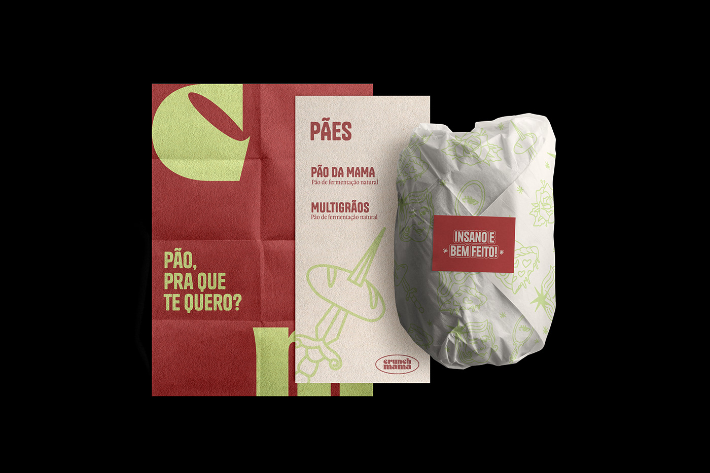
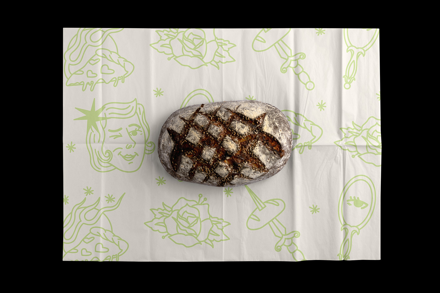
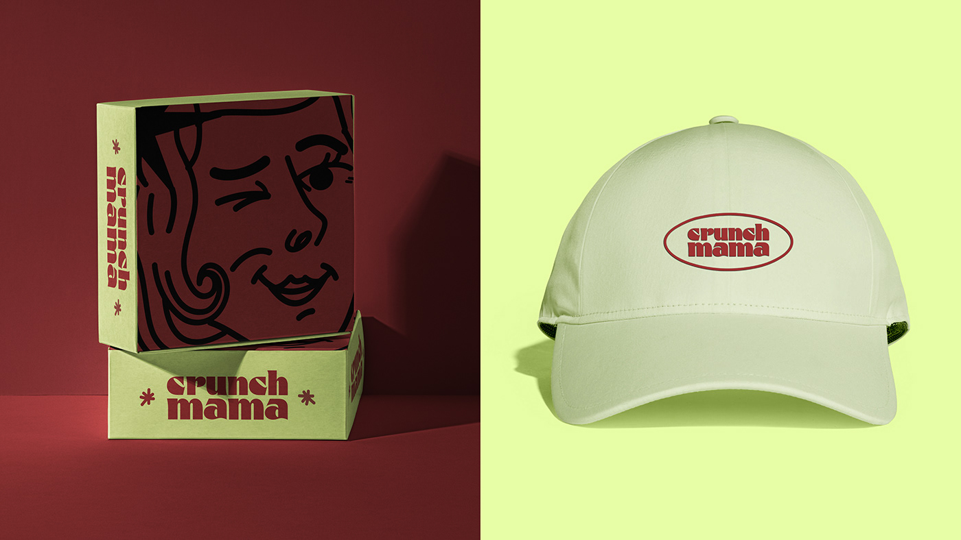
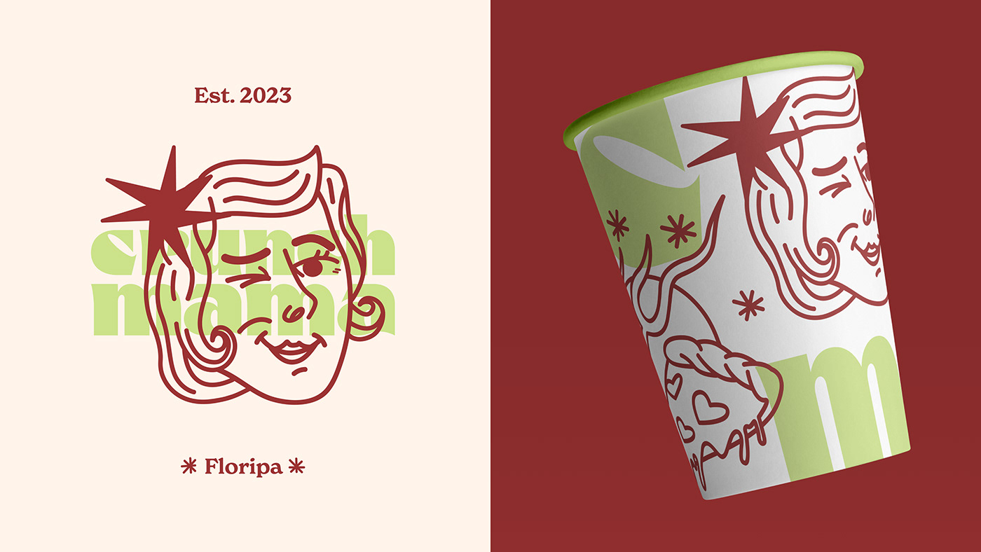
IDENTIDADE VISUAL
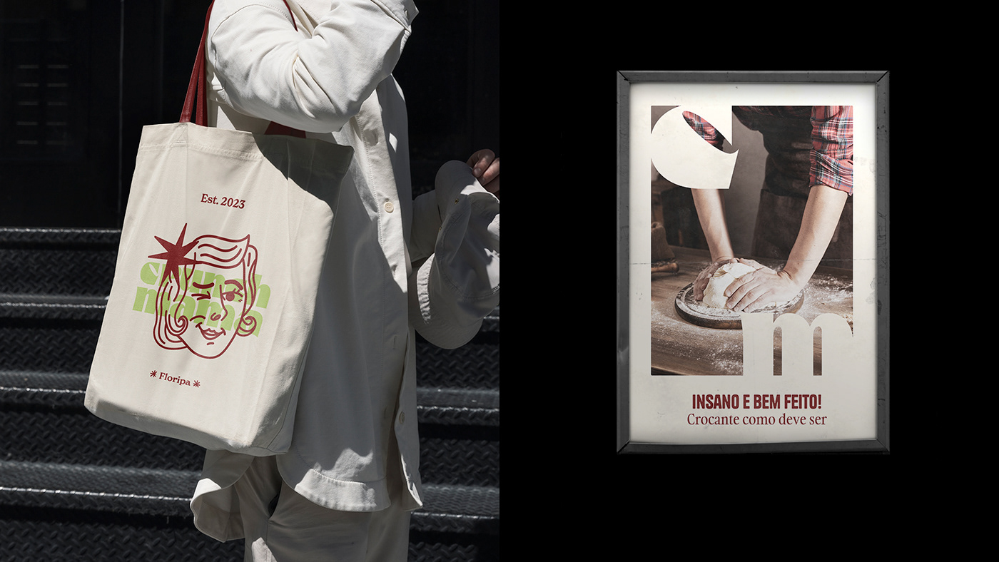
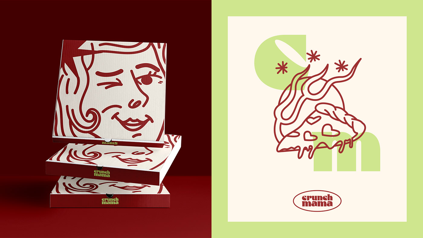
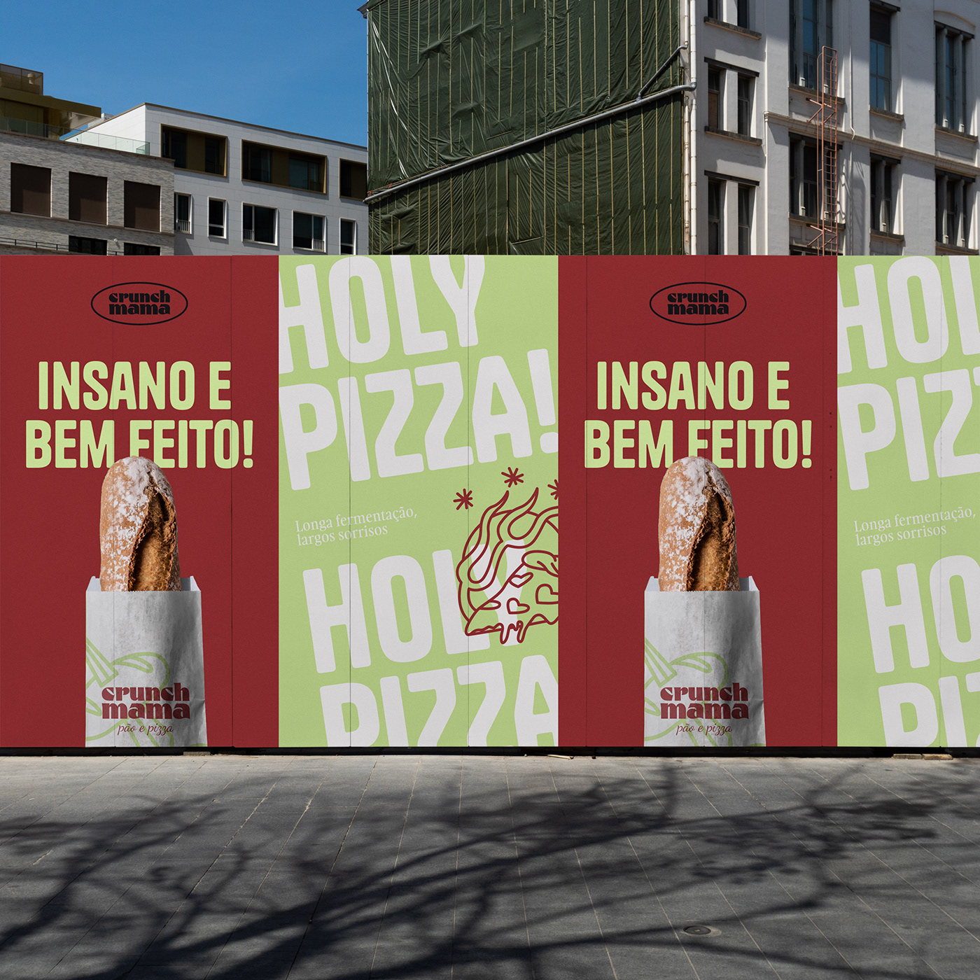
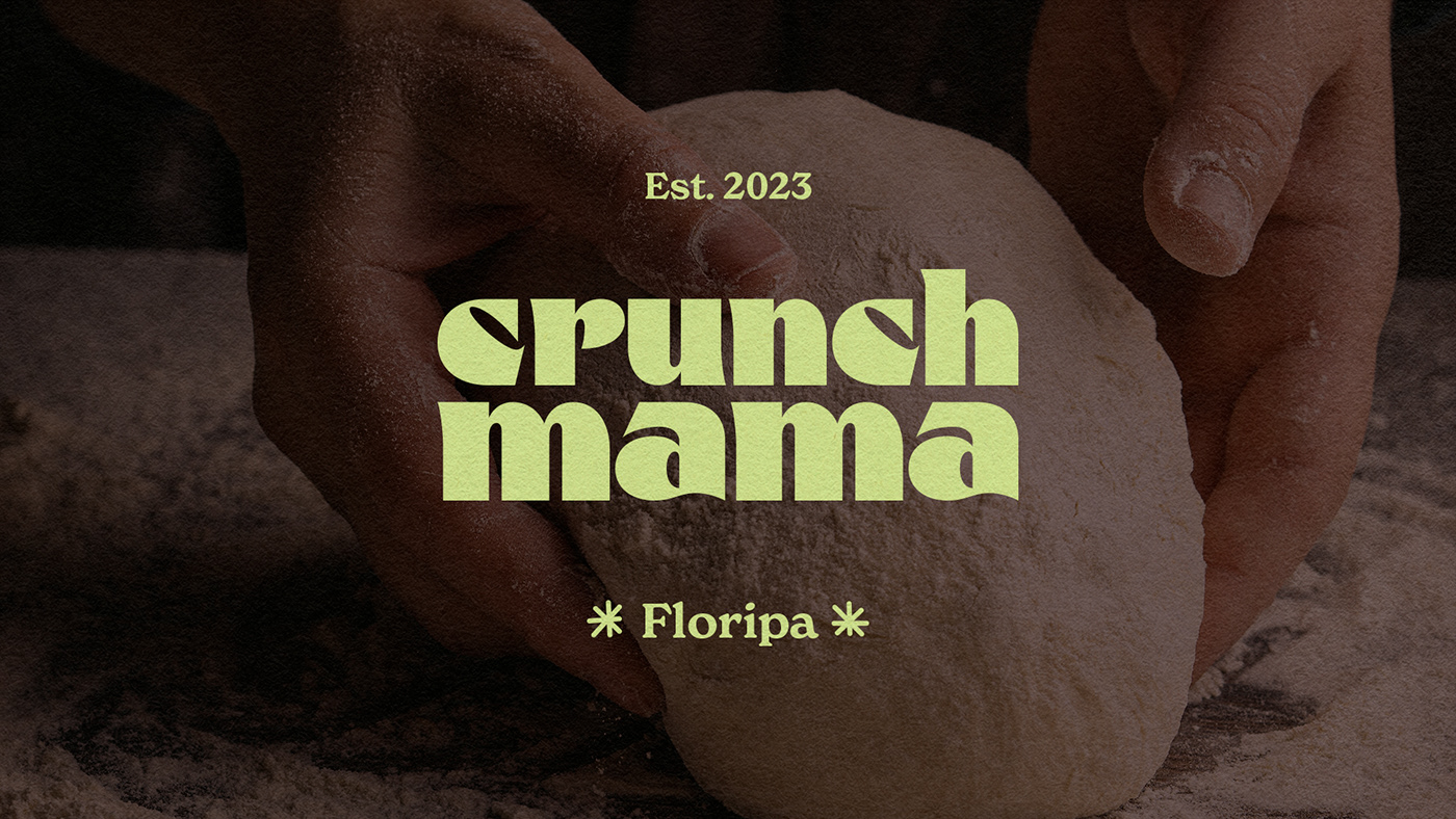
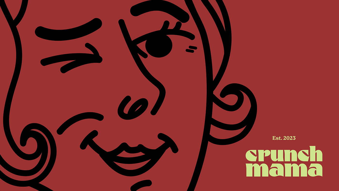
Mantendo a ideia inicial de homenagem e valorizando o nome, o logotipo de Crunch Mama evoca a crocância da massa com o conforto da matriarca. A tipografia moderna em caixa baixa, com os cantos arredondados, tem um ar amigável. No entanto, algumas extremidades são pontiagudas e irregulares, remetendo à sensação crocante. A escolha das cores foi pensada para promover algo inusitado, utilizando a energia e irreverência do vermelho, a acidez e autenticidade do verde, e o conforto e neutralidade do bege.
VISUAL IDENTITY
Maintaining the initial idea of tribute and honoring the name, Crunch Mama's logo evokes the crispiness of the dough with the comfort of the matriarch. The modern lowercase typography, with rounded corners, carries a friendly vibe. However, some edges are sharp and irregular, reminiscent of the crunchy sensation. The choice of colors was intended to promote something unconventional, utilizing the energy and irreverence of red, the acidity and authenticity of green, and the comfort and neutrality of beige.
PT
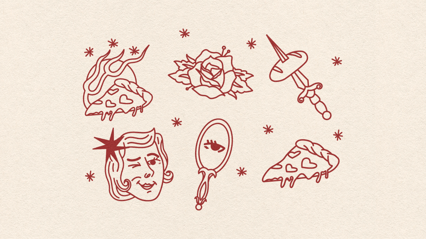
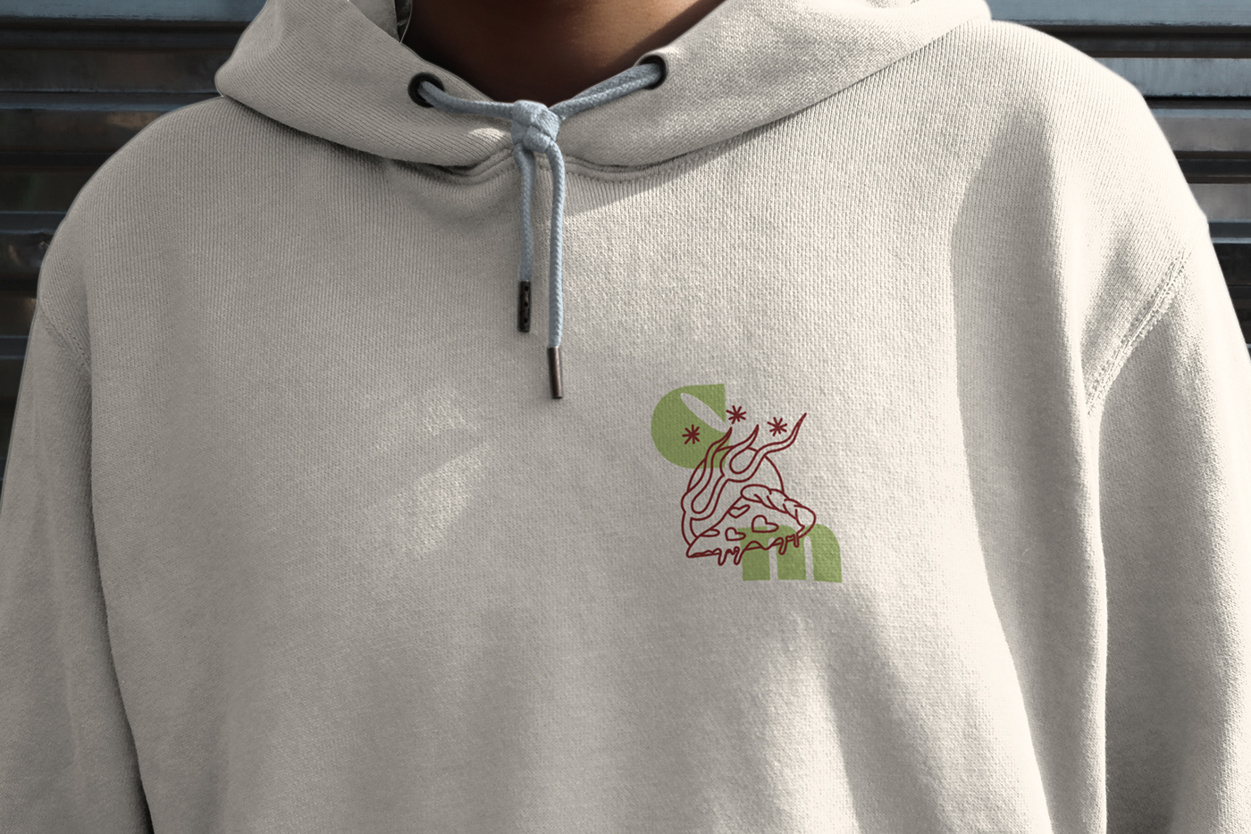
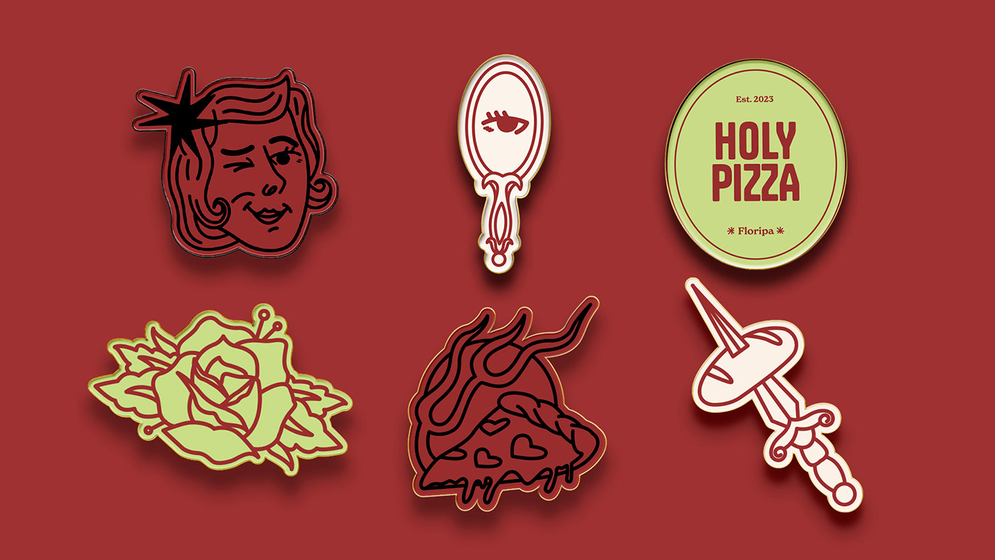
ILUSTRAÇÕES
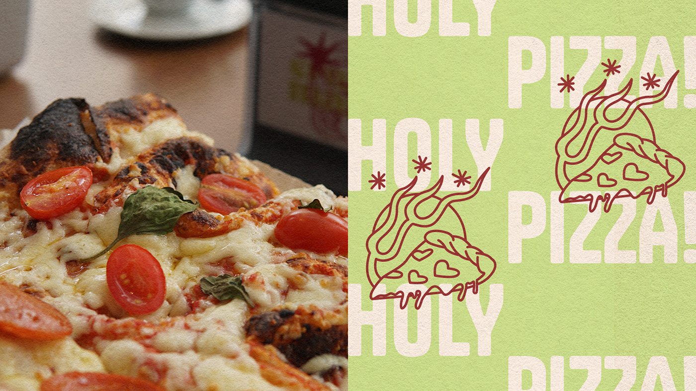
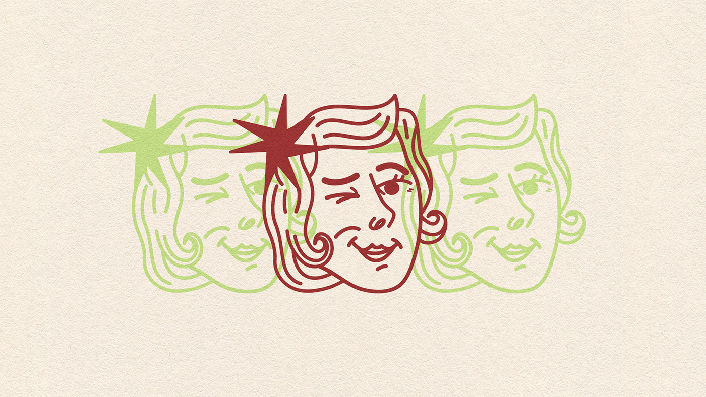
As ilustrações buscam trazer o ar mais rock'n'roll e irreverente da marca. Inspiradas no estilo old school de tatuagem, esses elementos visuais possuem um aspecto artístico que equilibra o vintage e o moderno. Nas ilustrações, destacamos elementos-chave de Crunch Mama: a avó, os pães, as pizzas e outras figuras clássicas da linguagem old school, como a rosa e a adaga.
EN
ILLUSTRATIONS
The illustrations aim to bring out the rock'n'roll and irreverent vibe of the brand. Inspired by the old school tattoo style, these visual elements have an artistic aspect that balances vintage and modern. In the illustrations, we highlight key elements of Crunch Mama: the grandmother, breads, pizzas, and other classic figures from the old school language, such as the rose and dagger.